Showing posts with label Inspiration. Show all posts

Tuesday, 11 May 2010

3D Shoot//


Heidi Mount
Dansk Spring 2010

Head Feather Image sourced Studded Hearts

Ideas and inspiration for our 'world traveller 3D' shoot directed by Amy Gurer which will feature up and coming model Camille Armstrong.

Kate.

Thursday, 29 April 2010

The Factory Girl//


The Factory:
Fashion youth culture
Fashion, photography, models, hair, makeup, magazines...
Informative
Dark
Edgy
Youthful
Fierce
Iconic
Grunge
Attitude
British aesthetic

Wednesday, 28 April 2010

Tank//


This is a page from Tank magazine 'The Blonde Issue' which features a collection of images showing models showcasing various looks from the catwalk. Tank has a very distinctive look which differentiates itself from other underground fashion publications, they 'seek to be informed, articulate and original'. Every issue features various big names and emerging talent though fashion design and photography.

Visit Tank Magazine: http://www.tankmagazine.com/
Tank Blog: http://tankmagazine.tumblr.com/

Kate.

The Something Issue//

A lot of the magazines we looked at when we were trawling through our collections produced each issue with a different theme, which is something we liked. For example, i-D have recently produced 'The Lovers of Life' issue, the latest 125 is the America issue, and Nylon have done a Denim issue.

We'd like to use this as a focus for our zine, so we started thinking of ideas for different issues.

We'll have to think of some good type to go with each issue, but so far we've settled on doing a Photography issue, and an issue dedicated entirely to Supermodels. More issue ideas to come..!

Nic.

Sassy//

Whilst reading up on teen blogging sensation Tavi Gevinson, I came across one of her most recent posts on an American vintage teen mag, Sassy. She's obviously quite obsessed with the magazine and has fans send her back copies so that she can get to read them, and after looking at her post, I can see why.

For it's time (1988-94), and particularly for its teen audience, Sassy had quite an abruptly opinionated and somewhat grown up tone of voice, although this may have been something to do with its founder being feminist Jane Pratt. It featured some influential people, for example Kurt Cobain and Courtney Love, and Pratt is credited for spotting Chloe Sevigny.

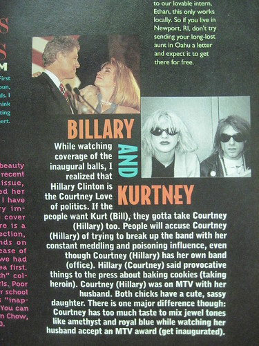
In this article, they've mixed up the lives and characteristics to compare Hillary Clinton with Courtney Love. This is quite a strong statement for a teen magazine to make about the President's wife and the turbulent partner of a drug fuelled rock star, and is a perfect example of the kind of content that Sassy covered.

Perhaps my favourite part of Tavi's post was her analysing this front cover.


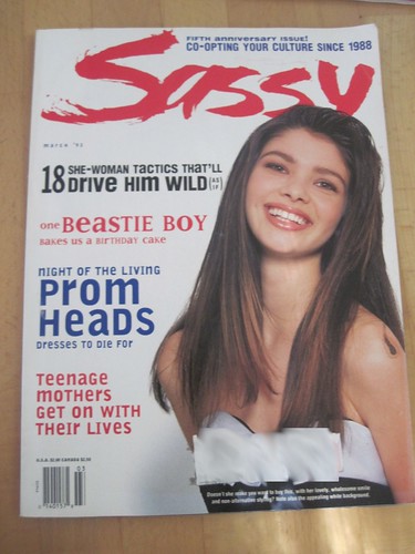
Whilst it looks like any other American teen mag, Tavi took a photo of the caption that sits just at the bottom of the page.

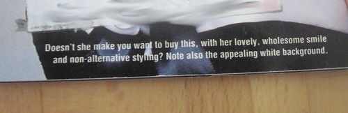
I love the use of irony here, and although this probably isn't something we want to take on board for our magazine - I thought it was worth mentioning a publication that mocked the usual system. The full post on Sassy by Style Rookie is available here.

Nic.

Tuesday, 27 April 2010

Dead Pan Sam//

Whilst trawling through the wasteland that is Facebook, I came across a Tillate-style photograph that a friend of mine had been tagged in, with a blog address underneath. Out of pure blog curiosity, I decided to have a look, and have since been following a photographer under the name Dead Pan Sam, since January.


He runs two blogs - Long Time Dead, which bases itself around his daily musings and happenings, and Partie! Partie!, a blog based entirely on the humorous events which take place of his university town, Brighton. I admire LTD for its attention to detail - it has a very honest, youthful tone (as does Partie! Partie!), however the focus of his photographs and the stories behind them really capture the characters of the people in them.

Partie! Partie!, however, has a very crude undertone. When it comes to these photo stories, Dead Pan Sam has no shame in humiliating the drunk in all their glory - and along with some fantastic captions, there's a real dark humour to this site.

As we as a team are inspired by photography, I think it would be good to feature Dead Pan Sam - an upcoming photographer who obviously holds a lot of passion for his art, and deserves to be recognised on a wider level. After showing Kate and Amy his blogs, they agreed and so we hope to do an interview with him, and ask if he'd be willing to do produce some photographs exclusively for The Factory.

Long Time Dead


Partie! Partie!

Jalouse et Nylon//

Jalouse has become a huge inspiration for our zine, as we love the thrown together vibe the layout gives off. Kate found the magazine on our trip to Paris, and fell in love with the cut and paste style, similar to that of another of our favourite magazines - Nylon. Both have quite similar styles, and the kind of scrap book vibe they give off is something we'd like to emulate with The Factory. In Jalouse, they even incorporated some doodles into one of the photoshoots.

Jalouse.

We really liked the scribbled effect over this feature on young blogger Tavi - again, it is similar to the idea we liked of having interviewees complete their answers onto a photograph, as with the Mario Sorrenti shoot and the spread from Oyster magazine.


Nylon.


Nic.


Fantastic Man//

Since picking up my first copy of Fantastic Man, I have fallen in love with the way the magazine is laid out. The way in which they display the sections in Chapters makes it different to other publications, and as with the other magazines we looked at, I love the way in which they use contrasting paper.

The great thing about Fantastic Man is how the paper reflects its content. So, for the editorial on the rather eccentric Hamish Bowles, they printed onto medium weight matte paper in an off-white. The shoot was shot by Jeurgen Teller, who's photography is renowned for having that gritty film, realistic aesthetic to it. The editorial on men's suits, however, was printed on high gloss paper. I also love the use of type - the mix of upper and lower cases within an article, and the traditional type used in a column format which gives a newspaper-esque feel about the magazine.


Nic.

Elle Collections//

In recent editions, the catwalk overview produced by Elle magazine, aptly entitled Elle Collections, has had a bit of a revamp. In comparison with its competitors at Vogue, the magazine is produced and sold separately to the main title, and the team at Elle have invested time into considering the layout and feel of the magazine, in order to give it a point of difference.

It comes larger than a usual magazine, and juxtaposes a range of catwalk and detail shots with backstage photos, as well as flitting from both matte and high gloss paper - even using different sized paper within the magazine.


Nic.

Vague Paper//

Again, Vague Paper is a magazine I picked up two issues of at London Fashion Week in September. Both issues predominantly contain photography, however both are produced differently.

The first few photographs show how Vague Paper No.7 is stitched together in sections - made up of four booklets held together with cotton. Although this looks beautiful and adds a point of difference, the magazine after a bit of wear and tear is beginning to come apart in its sections, which is something we'd have to consider if we were to use this method of production for The Factory.

The inside of the magazines are laid out well too, and in particular I like the way the writing has been displayed on the vertical.


Nic.